The Tidningskungen
Brand Manual
Overview
Welcome to the brand manual for Tidningskungen, Bladkongen, and Lehtikuningas.
It is important to follow this manual for several reasons:
- Coherence helps establish our brand values and bring some recognition to our customers.
- Some well-defined guidelines will help us avoid the most common pitfalls.
- A framework like this will make your design work easier.
The manual is a living document and we intend to improve it continuously. Keep checking out this site for the latest version. In addition to the instructions, all resources you need will be available in each section.
We hope you enjoy working with the Tidningskungen brand. Please use the checklist at the end when you are done, and never hesitate to reach out to us if you got any questions.
The Mediafy Design Team
Per Martinson
[email protected]
Johanna Noltin
[email protected]
Quick guide
TK Sans Narrow
TK Sans Narrow Bold
TK Mano Negra
PT Sans
PT Sans Bold
#b73235 #0078c1 #9fd6ff #eef8ff
Photo examples:


Logotype
The Tidningskungen brands and sub-brands all have their own logotype. However, the same basic rules apply for all of them and for the sake of convenience only Tidningskungen.se will be used in the examples below.
Placement
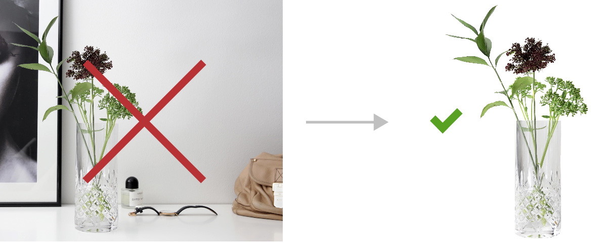
The logotype shall be placed either at the lower right corner or at the bottom center. It can also be placed at the center of the layout, but only if it is the main element. In really wide cases, such as a leaderboard banner, a right-center position is allowed.
Clearspace
Always make sure to keep a clear space around the logotype. This should be at minimum the width of the top domain element (see below).
Do’s and don’ts
- Do give the logo room to stand out and speak for itself.
- Do brighten or darken the area behind the logo when using contrast-rich backgrounds.
- Don’t modify the logo, its tagline or colors.
- Don’t use photos or patterns with lots of details behind the logo.
- Don’t use a drop shadow on the logo.
Partnership logos
When used together with partner logotypes, make sure to add some extra clear space in between, at least two top domain elements. When the partner logo is longer than ours, we prefer it to be at the same height as the text in our logo.
Miniature logo
For special cases, such as profile images or app icons, we got a modified miniature version of the logo. Please contact the design team if you believe you need this version.
Please contact the design team if you believe you need this logo.
Seasonal logos
We do have some modified versions of the logo for special occasions like Christmas or Valentine's day. Please contact the design team if you need any of these logotypes, or need a new one. Never attempt to assemble a seasonal logo on your own.
Get the logotypes
Downloadable files:
.png, .jpg, .eps, .svg,
download all
Typography
Our brand fonts are specially modified and are free to use in all kinds of media within the company and its partners. The complete licensing information is attached to the fonts when you download them.
Primary headline font
A modified version of PT Sans. Use this font for the main headlines and messages. This is the font we use in the “headline streamer” elements (see Graphic elements).
TK Sans Narrow Bold
ABCDEFGHIJKLMNOVWXYZ
abcdefghijklmnopqrstuvwxyz
Optical kerning / Tracking 0.0
Secondary headline fonts
Use these fonts together with the primary headline to add dynamics and contrast. TK Mano Negra Bta (a modified version of WC Mano Negra, by permission from WC Fonts) could be used as the primary headline, while TK Sans Narrow should never appear without TK Sans Narrow Bold.
The font TK Mano Negra should always be set at a 5° slope.
TK Sans Narrow
ABCDEFGHIJKLMNOVWXYZ
abcdefghijklmnopqrstuvwxyz
Optical kerning / Tracking 0.0
TK Mano Negra Bta
ABCDEFGHIJKLMNOVWXYZ
abcdefghijklmnopqrstuvwxyz
Optical kerning / Tracking 0.0 / 5 degree slope
Body text fonts
Longer text blocks should be set in PT Sans Regular/Bold at a smaller size. The line spacing should be at least 1.3 times the size.
PT Sans Regular
ABCDEFGHIJKLMNOVWXYZ
abcdefghijklmnopqrstuvwxyz
Optical kerning / Tracking 0.0 / Line-height minimum 1.3x
PT Sans Bold
ABCDEFGHIJKLMNOVWXYZ
abcdefghijklmnopqrstuvwxyz
Optical kerning / Tracking 0.0 / Line-height minimum 1.3x
In limited environments
When it is not possible to use our brand fonts, use Arial. Examples of such cases are email newsletters and Word or PowerPoint templates where fonts cannot be embedded.
Try to use Arial in the same manner you would normally use TK/PT Sans.
Arial
ABCDEFGHIJKLMNOVWXYZ
abcdefghijklmnopqrstuvwxyz
Optical kerning / Tracking 0.0 / Line-height minimum 1.3x
Arial Bold
ABCDEFGHIJKLMNOVWXYZ
abcdefghijklmnopqrstuvwxyz
Optical kerning / Tracking 0.0 / Line-height minimum 1.3x
Get the fonts
The fonts are free to use. Full licensing information is provided within the fonts.
Colors
Our brands have quite a liberal approach of using colors. With a few exceptions, most colors are allowed. However green is reserved for call-to-action elements and should not be used for anything else.
Call to action
Our CTA elements are green and white. To make these elements stand out, green is only allowed in those kinds of elements. Examples include buttons, checkmarks or other kinds of list bullets. Always strive to keep the amount of CTA elements down to what is needed for the primary aim of each layout.


Example uses for the CTA green color
Signature colors
Our signature colors are blue and red. These are the colors we use when we want to enforce the brand. Such examples could be a partnership banner, our website or an external campaign.
Do’s and don’ts
- Do strive for contrast when you combine colors. It is important to make the offers and messages stand out.
- Do choose bright and cheerful colors whenever possible.
- Do use the signature colors when branding is important.
- Don’t use green for anything else than a CTA element.
Example combinations
We allow all kinds of colors and combinations as long as the directions above are applied. If you feel uncertain, the combinations below can be used or seen as an inspiration.


These combinations are just for inspiration. Of course, some high-contrast combinations need extra care and separation to maintain legibility.
Color values
#b73235 C0 M100 Y90 K20
#0078c1 C90 M50 Y0 K0
#9fd6ff C40 M0 Y0 K0
#eef8ff C10 M0 Y0 K0
#58a123 – only for CTA! C60 M0 Y100 K0
Download color swatches
MacOS color swatches (for Sketch etc.)
Photos
In an attempt to make our photos appear more consistent, we have separated them into three image classes depending on their use. All image classes might be used together in a single composition, as well as they might be used on their own.
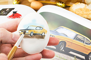
Motives
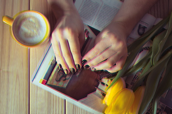
Motives are the centerpiece of a layout, besides the actual offer or message. They should always be photographed in natural light with a rather soft lighting.
We strive to have hands or other body parts visible in the motives whenever possible, to add a sense of humanity. To avoid attaching a specific persona, we never include faces or full body photos.
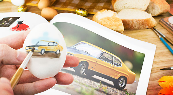


Motive photos might include a background or be isolated to be put on a separate background image.
Backgrounds
The backgrounds are what sets the tone of the composition and can have a wide range of appearances. It is important to keep it simple without too many disturbing details, and with good contrast to the main motive and message.


The backgrounds should be clean to avoid interfering with the message. If it contains details, these should be put at the edges.
Photos of free gifts
The images of the free gifts are something we lack control over since they come from a lot of different sources. To keep some consistency we want the images to be isolated on either transparent or white background. If there is no such image, we try to edit it ourselves. If you really need to use an image of a free gift with a background, consider using it as a motive image instead.

The photos of free gifts should always be isolated.
Image effects
We got two custom effects that you can use for the photos. They draw inspiration from our magazine roots. The halftone effect is achieved with an image overlay, while the channel split can be produced with a photoshop script. Use them on compositions of background and a motive images. The filters should never be used on the free gift images.

Our custom image effects are not mandatory. Use them whenever you need to emphasize the brand identity in a photo.
Do’s and don’ts
- Do use photos with natural light, especially for motive images.
- Do isolate the premium images to a transparent or white background.
- Don’t use images with lots of details and contrast as backgrounds.
- Don’t use the special filters and effects on premium images.
Photo resources
Photoshop script for the channel split effect
(instructions included)
Halftone pattern (instructions included)
Graphic elements
Besides colors and typography, our graphic elements help to give the brand its expression. Using them right is important for keeping a consistent look and feel.
Headline streamers
The purpose of the headline streamer is to draw attention to the main headline. It can be used in various ways and color settings depending on its context and the content of the headline.


Use uppercase text in large streamers and lowercase in small ones.

The streamer should never exceed three lines of text. If you have got a long text message, split it up and place only one the most important part in the headline streamer.
Splashes
Our splashes are simple – a colored circle with the message in TK Sans Narrow Bold. When the message is long, TK Sans Narrow Bold should be contrasted with TK Sans Narrow at a smaller scale. See a few examples below.


Numbers are always priority within the splashes. If there is a number in the splash, make it big. If not, consider turning the message into something numeric.
Arrows
We got a set of arrows for our calls to action. These can of course be rotated and flipped as needed, but should always be resized proportionally. Use them in any color you want.

The “hand-drawn” arrows are designed to be used with the TK Mano Negra font.
Drop shadows
It is usually a good idea to put a drop shadow behind the headline streamer and the splashes. The shadow should have a soft appearance. A starting point could be 3px offset, 10px blur and 50% opacity, though you will of course need to tweak the values yourself to best fit your layout.
TK Dingbats
In addition to the fonts in the Typography section, we got a specially designed dingbat font, TK Dingbat, which contains all the general icons and symbols. Check out this font and try to use its content before adding any custom symbols.
Achieving contrast in the layouts
The core of the Tidningskungen brand has always been great offers. We want to emphasize this in our design language. Our way of doing so is by using contrasting elements. Try to achieve contrast between the elements in more than one way. We do not just combine a rectangular shape with a circle, we also want the rectangle and circle to have contrasting colors as well.
Other examples of contrast might include the color of the foreground and background or to use the handwritten TK Mano Negra in combination with the more strict TK Sans.
Do’s and don’ts
- Do use a headline streamer for the primary headline.
- Do try to put figures rather than long text in the splashes.
- Do use the same font size on all text in the headline streamer.
- Do use the standard symbols and icons in TK Dingbats.
- Don’t put long text in a headline streamer.
- Don’t skew or squeeze the arrow elements.
Get the graphic elements
Photoshop script to generate the headline streamer
(instructions included)
Download the TK Dingbat font
Splash templates: InDesign, Photoshop Arrow templates: .png, .ai, .svgDrop shadow circa settings
3px offset, 10px blur and 50% opacity
Checklist
-
Does the logotype have enough clearspace?
It is important to give the logo enough room. See the logotype section for more information.
-
Is the logotype placed in the bottom center or lower right section of the layout?
The logotype should follow our consistent placement directions. See the logotype section for more information.
-
Do you use green in any non-CTA elements?
Green is a reserved color and should only be used in call-to-action elements. See the colors section for more information.
-
Do you use the symbols in the TK Dingbats font?
Checkboxes, icons and other common symbols are collected in a dingbat font. See the graphic elements section for more information.
-
Do the text include hyphenations?
Hyphenation should be avoided due to their legibility issues. See the language section for more information.